Color Blocking: Contemporary Updates for Traditional Forms
The Historical Roots of Color Blocking
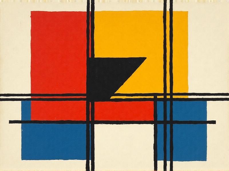
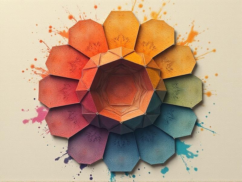
Color blocking’s origins trace back to early 20th-century avant-garde movements like De Stijl and Bauhaus, where artists sought to distill art and design into elemental forms. Piet Mondrian’s grid-based paintings, characterized by intersecting black lines and primary-colored rectangles, became a visual manifesto for simplicity and harmony. These ideas spilled into architecture and product design, emphasizing functionality paired with bold aesthetics. Beyond Europe, traditional cultures—such as Japanese kimono artisans using contrasting obi sashes or West African textile weavers employing vibrant strips—practiced their own forms of color blocking long before it became a modernist trend. This fusion of global traditions and radical modernism laid the groundwork for today’s reinterpretations.
In the 1960s, fashion designers like Yves Saint Laurent reimagined Mondrian’s motifs, translating them into wearable art. The iconic "Mondrian Dress" encapsulated how historical art could breathe new life into contemporary mediums. Similarly, Pop Art’s embrace of saturated hues and sharp contrasts further cemented color blocking as a tool for visual rebellion. By bridging the past and present, these pioneers proved that color blocking isn’t just a trend but a timeless language of expression.
Modern Fashion: Reimagining Classic Silhouettes
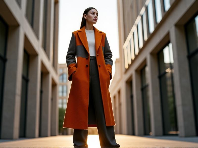
Contemporary fashion has embraced color blocking to reinvent traditional garments—think trench coats, blazers, and A-line dresses sliced into vivid segments. Designers like Jonathan Anderson for Loewe and Marni’s creative director Francesco Risso juxtapose unexpected hues on classic shapes, creating tension between familiarity and innovation. A structured blazer might feature a crimson lapel against a navy body, while a minimalist shift dress could be split diagonally by emerald and cobalt. This approach not only revitalizes timeless silhouettes but also challenges perceptions of how color interacts with form.
Streetwear brands have also adopted the technique, merging athletic cuts with chromatic daring. Sportswear staples like track jackets and hoodies are reworked with neon panels, nodding to retro aesthetics while feeling undeniably fresh. The result is a wardrobe that balances heritage and audacity, proving that even the most conventional designs can become canvases for modern experimentation.
Interior Design: Bold Hues Meet Timeless Architecture
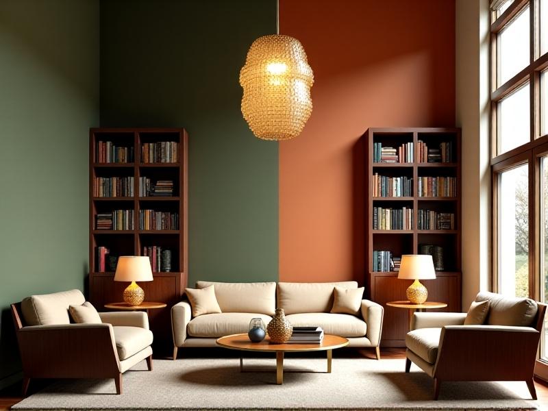
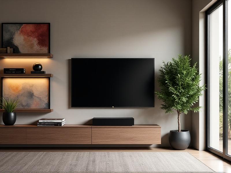
In interior spaces, color blocking transforms historical architecture into dynamic environments. Imagine a Georgian townhouse where walls are segmented into matte ochre and slate blue zones, complementing original crown molding. Designers like Kelly Wearstler and Faye Toogood use this strategy to highlight architectural details—a vaulted ceiling might be painted in a gradient of muted tones, drawing the eye upward. Furniture becomes part of the composition: a velvet sofa in mustard yellow placed against a deep teal wall creates a deliberate, arresting contrast.
Even in minimalist spaces, strategic color blocking adds depth. A neutral kitchen gains energy through cabinetry painted in alternating olive and blush panels, while a monochrome bathroom might feature a single tangerine-tiled wall. By respecting a space’s bones while injecting chromatic drama, designers bridge eras, making heritage feel current.
Digital Media: Pixel-Perfect Color Contrast

Digital platforms leverage color blocking to enhance user experience and brand identity. Apps like Instagram and Spotify use vibrant grids and gradients to guide navigation, while startups adopt bold monochromatic headers to stand out. UI designers prioritize clarity through high-contrast palettes—think cobalt buttons on a pale gray background—ensuring accessibility without sacrificing style. This approach echoes modernist principles, where form follows function, but with a contemporary twist: animated color blocks that respond to user interaction.
Graphic designers, too, rework vintage motifs. Retro posters might be reimagined with neon trapezoids, or corporate logos stripped back to geometric essentials. In a world saturated with imagery, color blocking cuts through noise, offering immediacy and impact.
Artistic Expression: From Canvas to Public Spaces
Contemporary artists and muralists have expanded color blocking beyond galleries. Carlos Cruz-Diez’s optical installations and Faith XLVII’s street art employ flat, intersecting hues to engage public spaces. A historic neighborhood might feature a mural where cerulean and saffron planes clash against aged brick, creating dialogue between old and new. Sculptors like Anish Kapoor use monochromatic blocks to manipulate perception, turning solid forms into illusions of weightlessness.
Even traditional mediums like oil painting are revitalized through chromatic experimentation. Artists such as Sarah Morris deploy glossy geometric abstractions that reference urban grids, proving that color blocking remains a versatile, evolving tool.
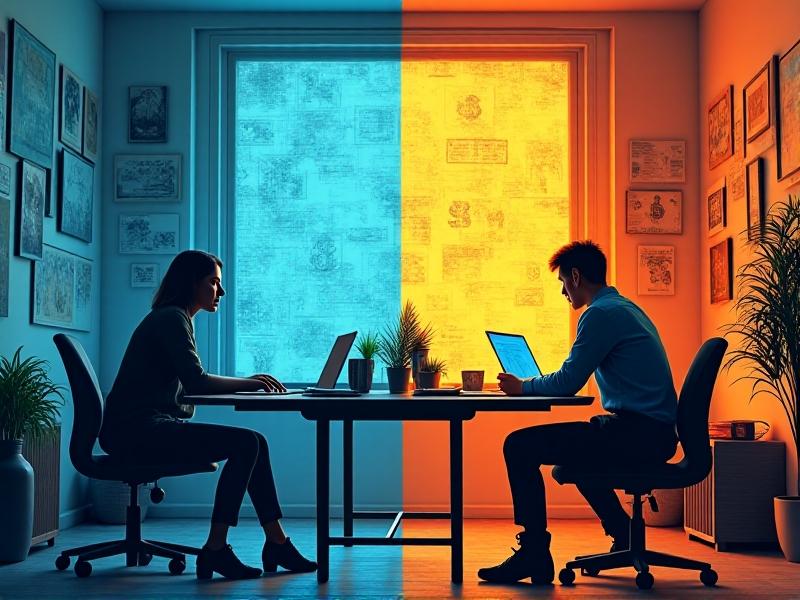
The Psychology of Color: Emotion and Cultural Resonance
Color blocking’s power lies in its psychological impact. Red and yellow segments might evoke urgency or joy, while cooler blues and greens instill calm. Cultural context amplifies this—a vermillion block could signify luck in Chinese traditions or danger in Western ones. Designers harness these associations to craft narratives; a brand targeting global audiences might pair earthy tones with vibrant accents to balance universality and locality.
This duality—personal and collective—makes color blocking a potent communicator. Whether in a logo, a living room, or a canvas, the interplay of hues transcends aesthetics, shaping how we feel and connect with our surroundings.