The Art of Subtraction: Creating Airiness in Heavy Pieces
The Philosophy of Subtraction in Design
In a world where complexity often masquerades as sophistication, the art of subtraction emerges as a radical act of clarity. Designers across disciplines—architecture, fashion, visual arts—are rediscovering the power of omission. By stripping away excess, they reveal the essence of form and function. This philosophy isn’t about minimalism for its own sake; it’s a deliberate strategy to create airiness within inherently heavy structures. Consider the difference between a dense novel and a haiku: both convey meaning, but the latter achieves resonance through precision. Similarly, subtracting material, color, or detail from a design allows its core identity to breathe, transforming weight into weightlessness.
Architectural Mastery: Lightening Structural Mass
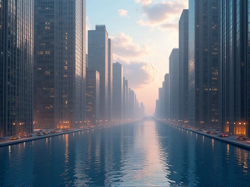
Architecture has long grappled with the paradox of heaviness. Concrete, steel, and stone are inherently massive, yet visionary architects manipulate these materials to defy gravity. Take Tadao Ando’s use of raw concrete: by carving out precise windows and skylights, he transforms cold, monolithic walls into vessels for light. Similarly, Zaha Hadid’s fluid geometries create movement in static forms, using curvature to dissolve visual bulk. The key lies in strategic voids—courtyards, atriums, and cantilevered sections—that carve negative space into buildings. These voids aren’t empty; they’re active participants in the design, channeling airflow, sunlight, and human movement to make structures feel alive rather than inert.
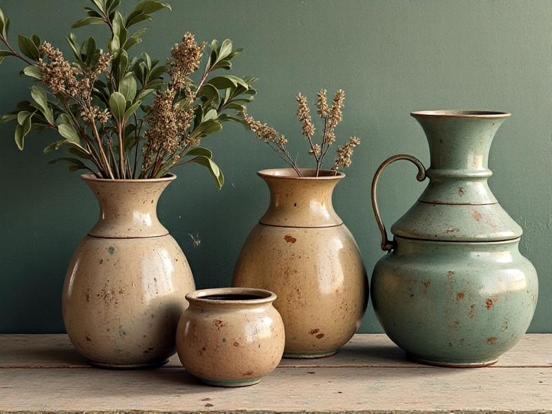
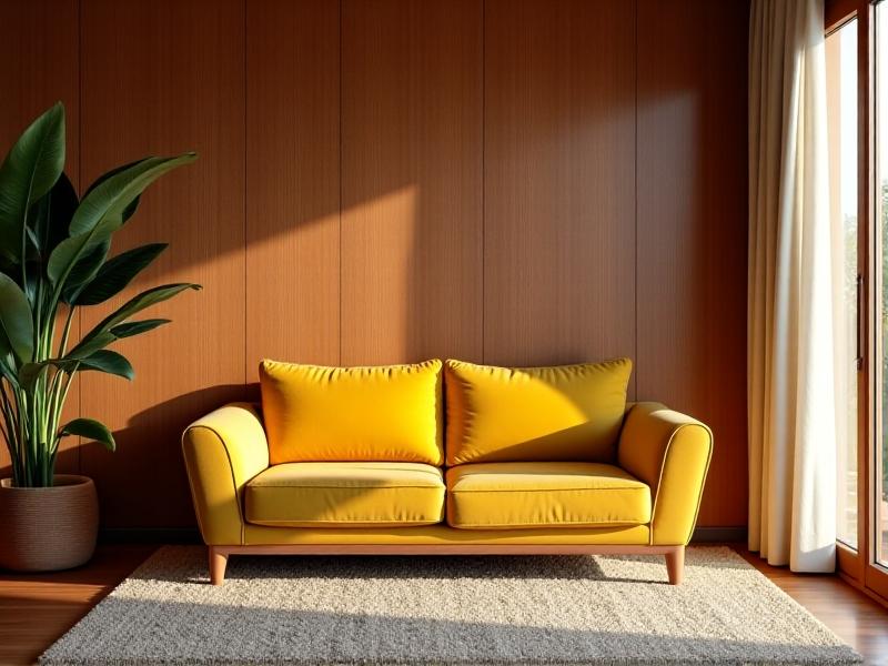
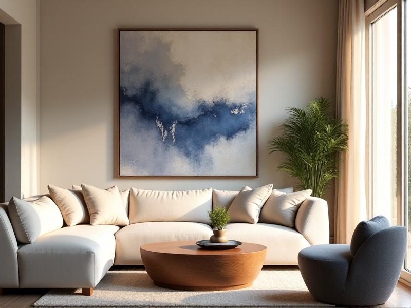
Interior Alchemy: Breathing Space into Rooms
Interior designers face a unique challenge: how to make cluttered spaces feel expansive without sacrificing warmth. The answer lies in layered subtraction. Start by editing furniture—replacing bulky sectionals with leggy, low-profile seating. Next, embrace verticality: floor-to-ceiling curtains draw the eye upward, while floating shelves replace heavy cabinetry. Color plays a subtle role; a monochromatic palette with varying textures (linen, brushed metal, matte ceramics) adds depth without visual noise. Even decor follows this ethos: a single oversized artwork commands attention more effectively than a gallery wall. The result? Rooms that feel curated, not cramped—a sanctuary where every object earns its place.
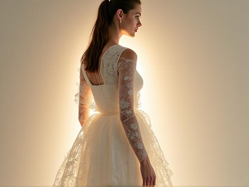
Fashion’s Delicate Balance: Weightless Textures
Heavy fabrics like wool and leather dominate winter collections, but avant-garde designers are reimagining them as ephemeral layers. Techniques such as laser-cutting intricate patterns into leather or weaving metallic threads into sheer knits reduce physical and visual weight. Iris van Herpen’s 3D-printed gowns exemplify this: rigid materials appear fluid, as if liquid metal has been frozen mid-drip. Even accessories participate—oversized earrings made of featherweight resin or perforated metal defy expectations of heft. The goal isn’t to erase substance but to redefine it, creating garments that feel both substantial and delicate, like a shadow with texture.
The Role of Negative Space in Visual Arts
Negative space—the unoccupied areas around a subject—is the silent hero of composition. In painting, it directs the viewer’s gaze; in sculpture, it defines form. Take Ai Weiwei’s “Circle of Animals Zodiac Heads”: the empty plinth beneath each bronze head amplifies their cultural absence. Photographers like Hiroshi Sugimoto use vast, unbroken horizons to magnify the subject’s isolation. Even digital art leverages this principle: glitch art often relies on data voids to create tension. By mastering negative space, artists transform emptiness into a narrative device, proving that what’s omitted can be as compelling as what’s shown.
Material Choices: Transparency and Sheer Elements
Materials themselves can perform subtraction. Glass bricks, perforated metals, and translucent resins allow structures to dematerialize. Architect Shigeru Ban’s paper tube structures exemplify this: mundane materials become luminous when layered. In product design, Tom Dixon’s “Beat Lights” use spun brass with open weaves to soften their industrial edge. Even urban planning adopts this approach—green roofs and glass walkways dissolve the boundary between built and natural environments. The trick is to select materials that engage with their surroundings, reflecting or filtering light and space rather than blocking them.
Color Theory: Soft Palettes and Visual Weight
Color’s relationship with weight is psychological. Dark hues advance, light ones recede—a principle leveraged in interior design to “expand” small rooms. But airiness demands more nuance. Dusty pastels (muted sage, faded terracotta) add warmth without density. Gradients play a role too: ombré walls that fade from deep indigo to near-white create a sense of upward lift. Even metallic tones can lighten; brushed nickel or pale gold offers shimmer without the heaviness of polished brass. The key is restraint: a single accent color grounds the space, while neutrals handle the heavy lifting of cohesion.
Practical Steps for Implementing Subtraction
Begin with an audit: what elements serve function versus ego? Remove one non-essential item from every category (textiles, decor, furniture). Embrace modularity—a sectional that splits into chairs, a table with removable leaves. In architecture, prioritize cross-ventilation and sightlines; replace solid walls with sliding glass or screens. For digital designers, reduce UI elements by 20%; if usability isn’t compromised, remove another 10%. Remember: subtraction isn’t austerity. It’s editing for intention, ensuring every remaining element shines brighter in its newfound space.